

PARCA National Parks App
Mobile App Design
PARCA is an app that guides nature lovers through a vibrant journey to collect memories from national park adventures. The goal was to redesign the national parks service platform by highlighting essential content, adding incentives for users to explore, and creating a visual identity that would inspire adventures.
My Role: Content Organizer, Admire Animation, 20 Badge Illustrations, Prototyping, Wireframe Designs, User Testing, Deck Creation
Teammates: Ariel Chan and Bridgette Chen
Tools: Illustrator, Sketch, Principle, After Effects, Figma
Duration: Winter 2019, 5 Weeks

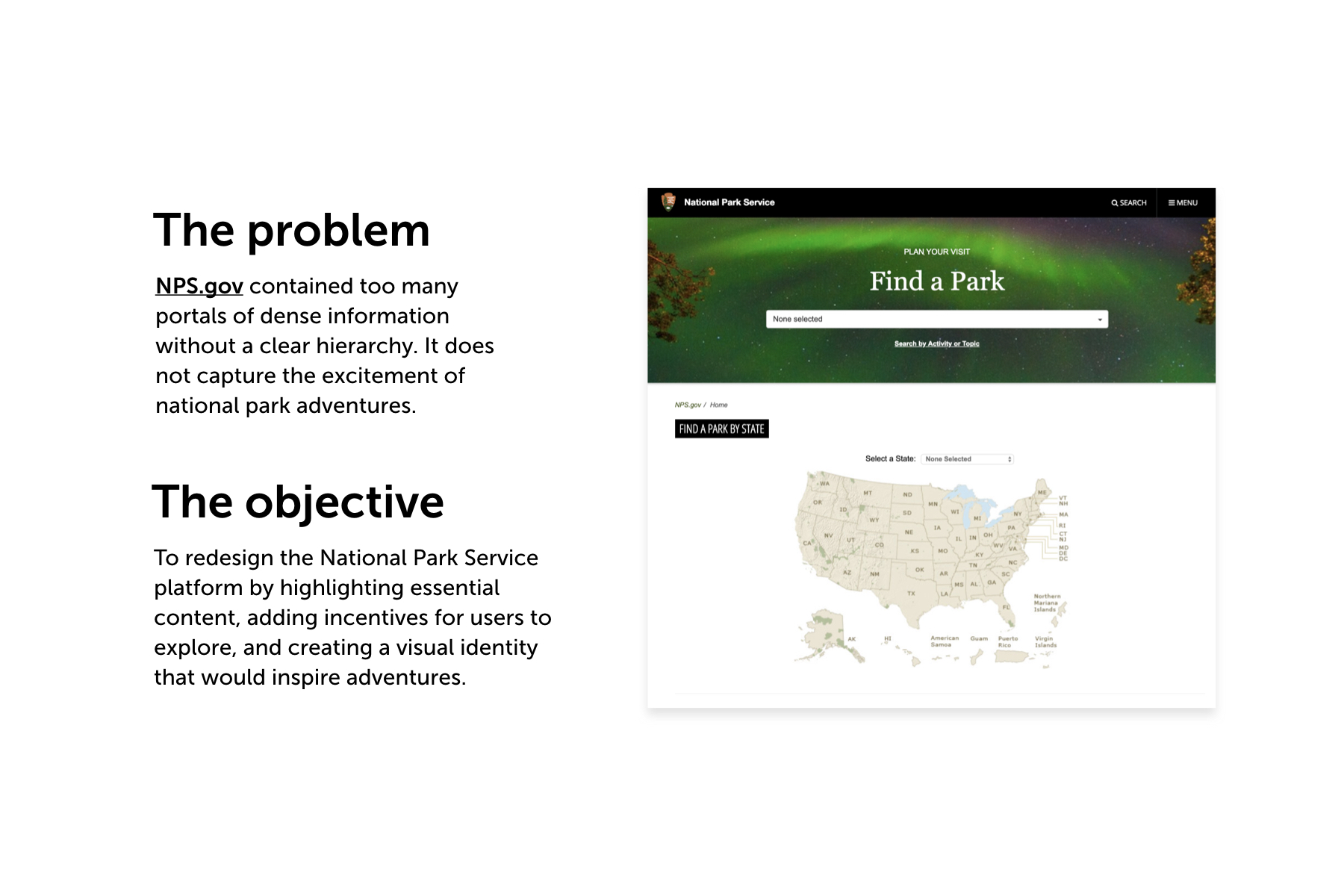
The Problem: Lack of Organization and Excitement
The national parks website, NPS.gov, contains too many portals of dense information without a clear hierarchy. The lack of organization makes it difficult for users to navigate throughout the website and be encouraged to find more information about the parks. In addition, the current website does not capture the excitement of the national park adventures that the user could experience.


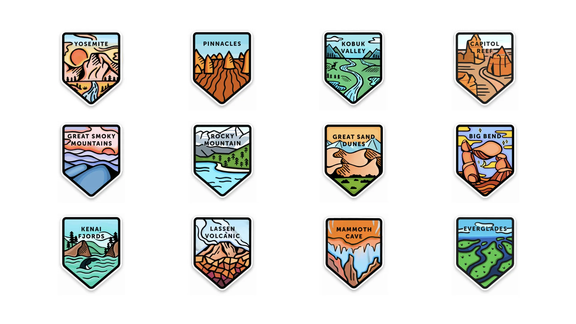
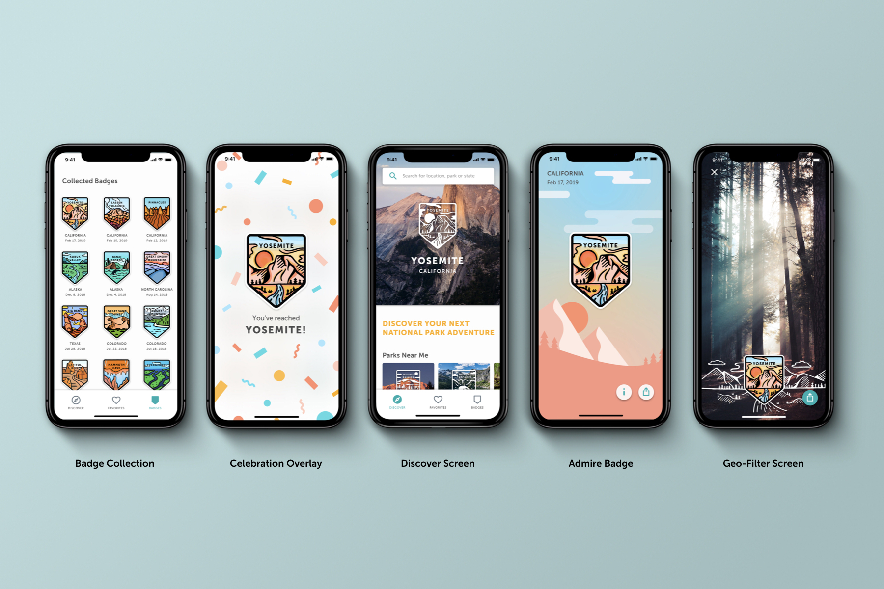
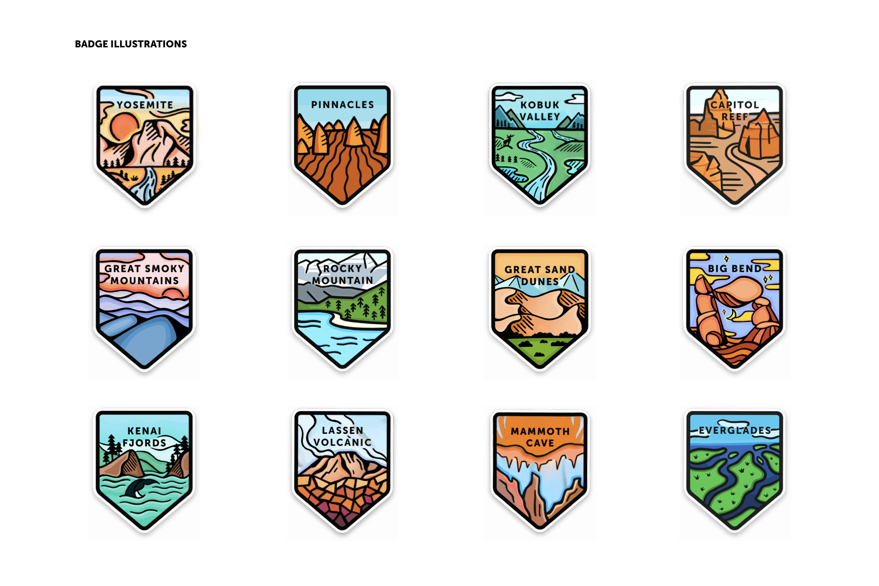
Main Incentive: Badges
Badges have not only been used as souvenirs, but as distinctive emblems worn as a mark of achievement, membership, and mark of office. My group saw potential in motivating users to actively explore more parks by having them collect and earn badges. We illustrated all 60 badges to make the traveling experience more personal and unique.


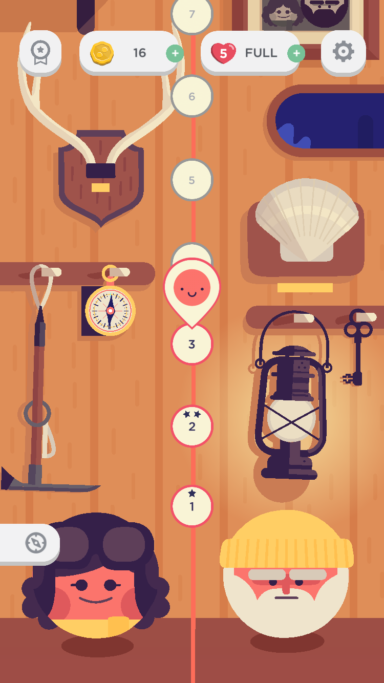
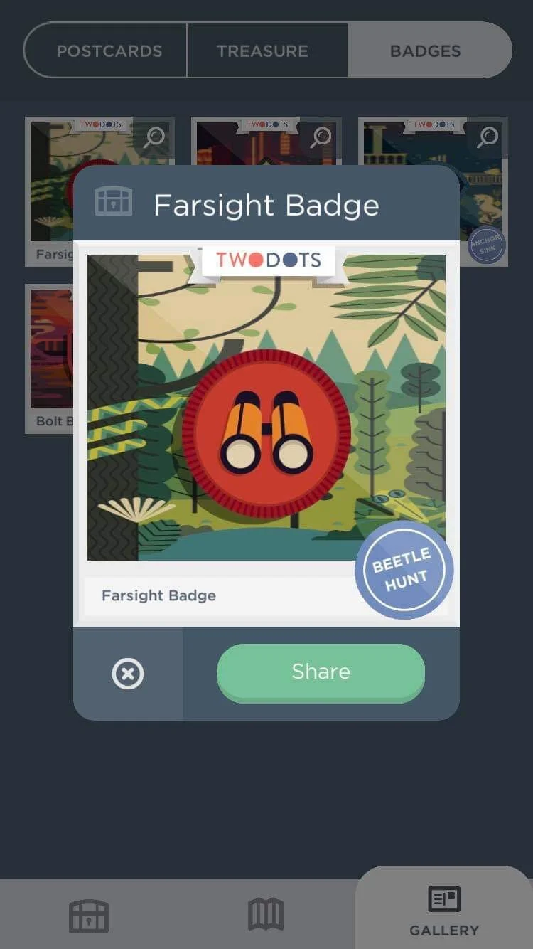
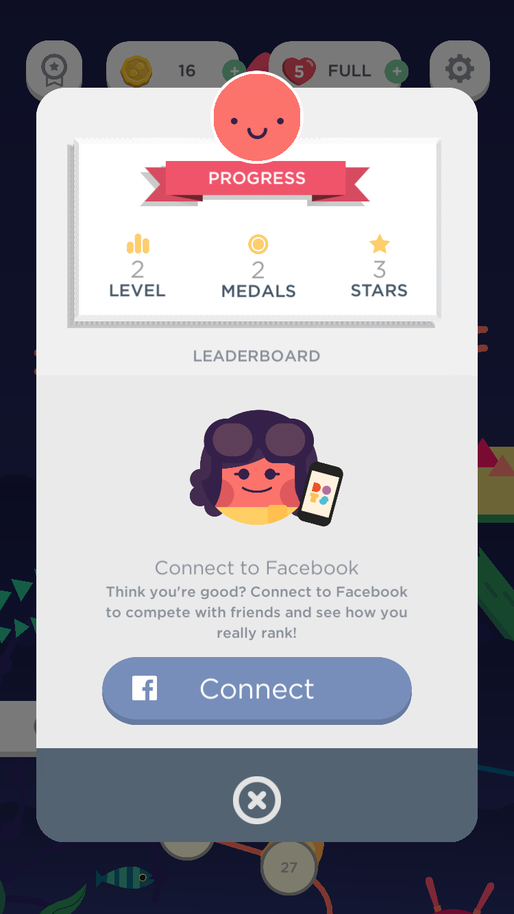
Main Inspiration: Two Dots
We gained inspiration from this game’s friendly visual language and thorough storyline. It had postcards made specifically for each adventure and a progress bar that motivated users to continue through the game and unlock more treasures.

Three Initial Concepts: Discovering a National Park
Concept One: Explore by activity of interest
Concept Two: Explore by location, in which the content is organized in an editorial format
Concept Three: Explore through a map that showcases the amount of parks in each state and the badges you can achieve.
Moving Forward: Concept Three
We kept the map feature to emphasize the action of discovering parks as the primary task and encourage travel.

User Testing with Three Individuals
We removed the map and organized the parks in an editorial layout to highlight the badges. We found that scrolling was easier for the user to process information than having to navigate through a map to locate a park.
Pain Points:
—Trouble identifying our icons (ex. bucket list icon looks like trash can)
—Categories were confusing because they were not specific enough
—Geo-filter can be more customizable and flexible.
Solution:
—Replaced bucket list icon with a heart, a more familiar option to save
—Removed “recommended” category since our “featured” one was similar
—Changed the category title “winter wonders” to “scenic parks in winter”

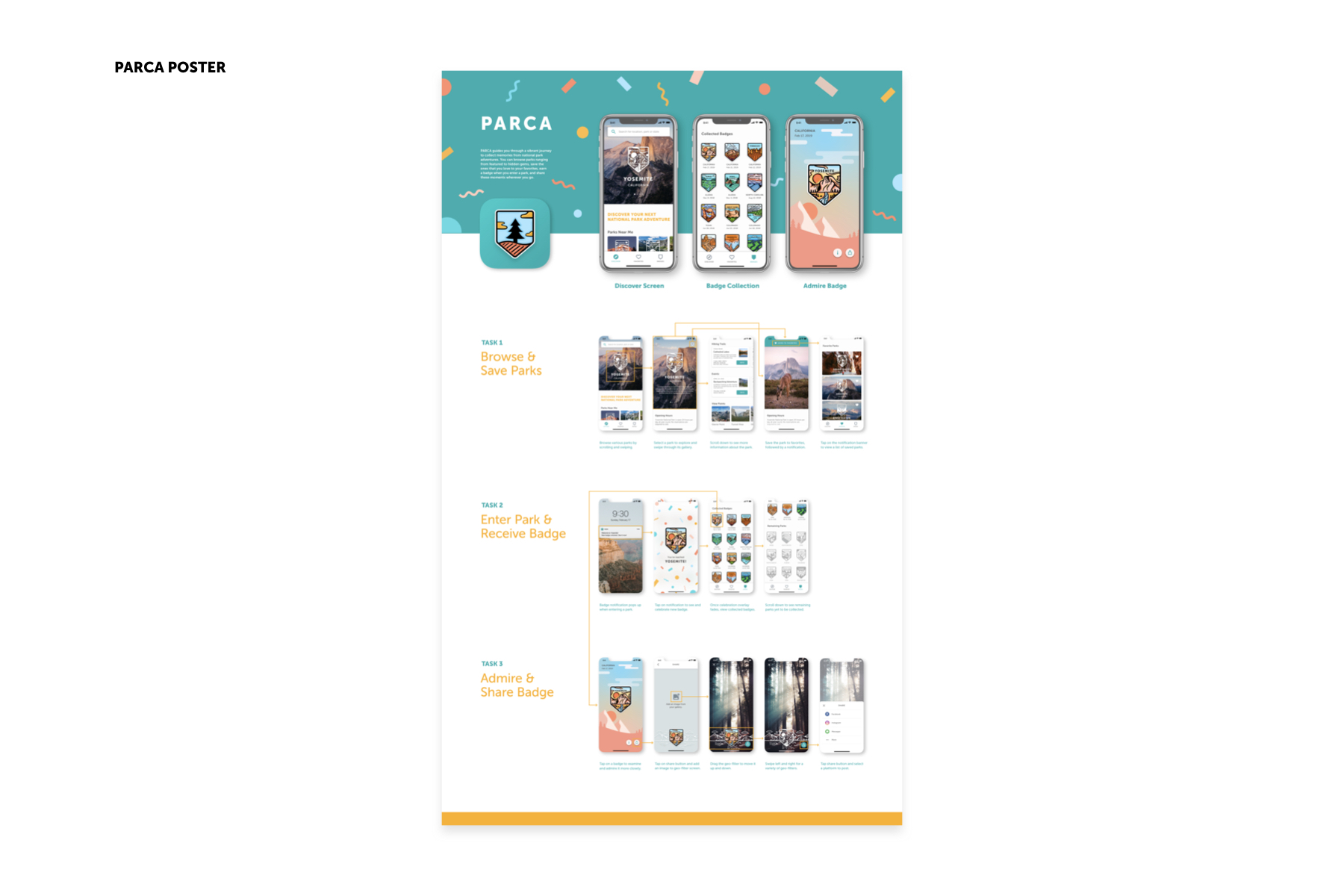
Task One: Browsing and Saving National Parks of Interest

Task Two: Enter Park and Receive Badge / Task Three: Admire and Share Badge
Final Reflection
Despite the 5-week time crunch, my team and I learned a lot and enjoyed working on each step of the project: user research, designing wireframes, iterating, user testing, branding, prototyping, video, editing, illustrating, and more. Unlike other projects, PARCA was especially challenging because we had to complete a visual project (illustrations), while thinking about the user experience and interface for our app. Also, this was my first time using procreate to illustrate, which was a challenging but rewarding experience because I had always wanted to improve my skills in this area.


Moving Forward
Make our app more accessible and account for a broader range of users by increasing color contrast.
Go beyond the app and expand the idea of receiving the badge by making stickers out of the badges we illustrated.
*Updated Colored Sticker Set Below*
My Colored Badges: Joshua Tree, Rocky Mountain, Pinnacles, Kings Canyon, Mesa Verde, Everglades, Capitol ReefAdd another layer of interaction and further gamify the experience by including a progress bar and more rewards/reminders for the user’s accomplishments.
